Saturday, February 26, 2011

[Evolution] : Jenga 3.0 + 4.0


For this latest edition of Jenga in our studio, we paired up in groups of three to create an emergence of public space. Our team, self titled "Evolution" were joining Kara Kooy's concept of crystallize, Kelly Harris's concept of pendulate, and my concept flow to create the space in the perspective you see below. Before we got to that point however, a process led us in our design from the decision to dub ourselves team Evolution. In our design we actualized the underlying theme of flow through the procession of capture and release within moments of enclosure within solids and moments of release through the perception of void upon discovering the glass patio. Through form, materials, and light, we explored the sense of enclosure and openness along certain paths to create a free flowing space. The main moments of enclosure take place on the first level padio as existing structures create more privatized patio spaces. There is a flow of light through the glass tiled second floor patio which unites the two public spaces while also dematerialize the connection. To enforce this floating effect, columns become thinner on the upper level.


first level

second level


exterior shot


first level nook


MORE TO COME!!(PROCESS AND WRITING)

Saturday, February 12, 2011

Reflection/Synopsis of Jenga 2.0 Critique

This past Fridays critiques demonstrated a variety of creative designs made completely unique from one project to the next due to the different people, processes and concept words. Kacie Leisure carried out her concept word of “well up” within interesting patterns of stacking and repetition, whereas Faith Ramsey created a cave-like space in pushing and subtracting elements to fit her concept word “protrude”. I saw many excellent board ideas that worked well to highlight the most important information in understanding projects such as Dajana Nedic’s Axonometric, cascading vertically down the side of her board. As always, presentations are a great time to take away inspiration from other’s techniques. For this past project I was inspired by Sharon Frazier’s model making technique in which she builds a frame out of basswood and coats it with a clean white Bristol board delivering a very crisp looking model. Kara Kooy’s craft in this past critiques model though was definitely attention worthy though especially in checking out her stairs. Overall in observing other’s layouts, I plan to use computer graphics for my plan drawings next time around in addition to printing out a board as I saw the presentations with these tow components to be some of the strongest and most readable. In such a short amount of time, some major planning must be taken into account in order to achieve results amounting to the excellent examples I saw of Friday. I had some major weaknesses in my project that I know were clear and will work to improve, but at the same time each critique I have taken away inspiration from others strengths.

Jenga 2.0.


Above: an interior of my model at 1/2'' = 1' scale. This is a food prep/dining office area. I placed a column right at the entrance to this space to enforce a straight path onto other areas of navigation. As my word was "flow", I used materiality to enforce this concept. In the pictures above this is shown through the continuous material from floor to built-in (dining/office nook) and through the vertical wood paneling transitioning across points of the room. I had imagined in true life this paneling to be a semi-shiny gray painted wood.


A ceiling plan demonstrating areas of capture and release through ceiling drops.


A perspective bringing the materiality into color. I personally like a loose hand rendering style for my perspectives to give the character of a quick glimpse of part of this space from behind a food-prep counter top.


Tuesday, February 1, 2011

Linking writing + reviewing

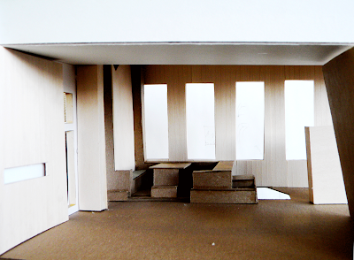
Faith Ramsey’s first space (11’ x 32’) played upon her concept “protrude” to develop the idea of carving out protrusions, much like a cave. This space used the two solids to create moments of enclosure, one accessible via a stairway., the other similar in its carved out form. Both solids certainly protrude from the space, keeping true to the concept, but from the drawing, there looks to be some leftover space that is used for a bathroom, a perfect example of how many bathrooms end up looking like left over space. These solids were most clearly visible through the axonometric drawings. Faith paid crucial attention to the built INS and solids unifying the space with her concept. The second space used two walls and one column the play upon the idea of crystallization through different heights and measurements. Seen most clearly through her axonometric drawing, her parts are not to see what the word meant so much as what the word does in a three dimensional setting. Centralizing the parts could be tempting in this square space, but makes segregates the kit of parts into an odd circulation for human traffic.The third space used the idea of protruding throughout the space in the form of circulation. Using two columns and one wall, Faith allows the user to “protrude through and go through different elements in the space”. Her whole space includes protruding elements throughout, easy to understand in an axon drawing, but not so much in a plan drawing.

Check out Faith's work here!


Phillip'c concept was "reverberate". In the first space he focused on reverberating through continuity. This space was my favorite because the continuity was executed so well. The stair case pushed up against a wall had one stair that became a shelving unit, wrapping around a continuous material much like the rest on the ceiling and floor materials. The two walls were used to privatize certain nooks, while the column continue from the first floor to the platform, successfully breaking up the space and shown clearly in his axonometric. The second (square space) ensued forced relaxation using two columns and one wall. This forced relaxation was questionable in my opinion, but he did do a good g=job creating special nooks. For instance, the floor was dropped around a daybed and permanent sleeping quarters were elevated, accessible via a ladder. The drawing were not very clear for this space, although a perspective helped me to understand the idea of the ladder more so. The idea of centralizing most of his kit of parts was risk not completely met with reward because the plan drawings indicate one one real circulation route. The last and largest space was depicted as a sound wave. His concept was translated fairly successfully in this iteration as space in the third dimension operates on three levels like a sound wave. The two solids coincided with his concept as the three levels were translated well in the axonometric in a floor change, allowing these three levels to indicate levels of privacy as well.


Check out Phillip's blog here!