Wednesday, November 17, 2010

Reading Comprehension 6

1.
Rolling into the twentieth century, all types of new inventions were on the rise. One developing in this early part of the of this century in particular was the automobile. Not only did the invention of cars affect the way people traveled, it also claimed its influence in art and architecture. This air of movement can be cited in the post-impressionism genre labeled expressionism and as well as the architectural style Art Nouveau. In the works of Kandinsky, we see an expression of free form movement, though not identical, still coincides with the ideas floating around Germany, Belgium, and Paris at the time through various structures. In Belgium, Victor Horta’s Tassel House captures great movement largely through the incorporation of a network of ironwork left unexposed in a celebration of the relatively new industrial material in the way of a seemingly vine-like lines continuously whiplashing throughout banisters surface decoration and supports. We see a similar “whiplash movement” in the ironwork winding through the staircase and hall at Atelier Elvira in Munich, designed by August Endell. This iron work is just as must an expression of movement as the work of Giacomo Balla in Italian expressionist art. A more geometric piece of this artist that incorporates free form movement along with contained form is his piece “Canto Patriottico a Villa Borghese”, easily relatable to the ironwork at the entrance gate in the Castel Beranger apartments in Paris. Kandinsky’s “Last Judgment
follows through with incredible motion; guiding ones eye across the canvas much like the fluid movement in the ironwork seen in Art Nouveau spaces at the time. Even taking a larger step away from the organic curves of the art and architecture fusing above, in Berlin, Henry Van der Velde took on a more geometrically moving pattern at the Havana Tobacco company cigar shop. The pattern weaving along the wall is an abstract interpretation of the sweeping and curving of cigar smoke. An expressionist artist at the time, Marcel Duchamp also abstracts the literal in his work like “Portrait of A Chess Player”, coinciding with this shop. This German take on Art Nouveau was known as Jugdstl or “young style” (Massey) bringing about a new approach to design for the new century. To say one was influence by or before another is an impractical approach in my opinion, for at this point in the early 20th century the air of movement was winding its way through all levels of design. “To an even greater degree than others before them, Art Nouveau designers see no separation between the fine arts of painting and sculpture and architecture and the decorative arts…They strive for unity in design to create complete expressions or what they call total works of art” (Roth 485).


2.
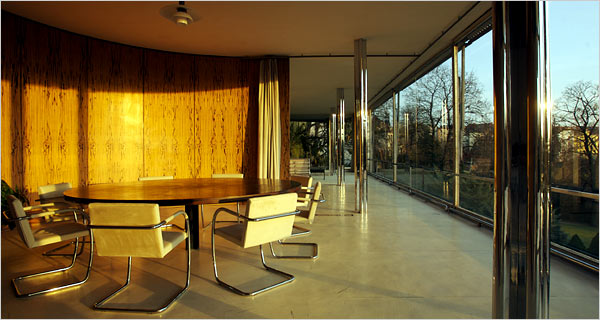
Within the broad statement “less is more”, a plethora of boundaries can be applied and tested. The implication of words ”simplicity” and “less” often times give off a message of affordability for some. Regardless of this opinion, the modern movements in design and architecture in the 20th century more often than not implied that this simple, good design should be for everyone, the underlying statement being everyone that could afford it. A prime example of luxurious simplicity in the early 20th century is Mies van der Rohe’s Tugendhat House in Brno (1930). This house was imbedded in simple, yet lavish surfaces like silver-grey raw silk for the curtains, wool rugs, tan and emerald green leather furniture and marble dividing walls. Even with luxury imbedded in its surfaces, there was little to no surface ornamentation, but highly technologically advanced (for the time) artifacts such as a seemingly simple glass window that actually retracted into the basement like a car window with the push of a button. In the case of the Tugenhat house, its simplicity certainly delivers “A machine for Living” in more ways for its surface. For example, Air conditioning was a relatively rare and luxurious amenity that made up some of this house’s technological complexity that today is standard in houses, whether their surfaces read- Machine for living or not. Unfortunately in many U.S. neighborhoods, only the internal complexities of the home in its “Tugenhat House like aspects” are what is typical. Although there is a movement towards a new opinion of the famous dictum “less is more” the epidemic of garage-centered homes having semi-classical elements slapped onto the surface, continues through the middle class living situation. This poses a different idea; if good design can be for all…who can afford it…or intentionally seek it.


Above, a beautiful work of the past including thoughtful design in both its surface and substance. Below a modern day McMansion. Hopefully not the future of design, thinking only of how the surface appears to the outside. I would be surprised if this was not simply a copy of another, with no great thought even involved (translating into a big house...with little substance)


A view of Frank Llyod Wright's Falling water. He developed his own hue of the vibrate red you see streamlining the windows and in some other furniture pieces seen in the back of this space called Cherokee Red. As the assignment was to draw a modern interior we believed to explode the notion that modern interiors all come together in stark and cold back and white,Meant as a retreat for the Kaufmann family, this interior brings in nature while providing some vibrant hues to an overall relaxing atmosphere.


Friday, November 12, 2010

Alternatives/Reflections Review


For the Alternatives unit, Corry Mears takes us through the different paths stranding off the ancient styles. Citing the ten rules of the rennaissance: single decorative facade, reviving the classics, man is the measure of all, separation of spaces, harmony through repetition, geometric patterning, patronage dominates the building industry, no building is one single style, boundaries/edges/borders are all vital, and separation of public/private, Mr. Mears guides us through how these rules are applied in the works of historical greats such as Andrea Palladio. Through his insight of Villa Capra and a few other renaissance master pieces, we get a clear depiction of what this unit is about. Abigail Buchanan follows a similar route in her alternatives point, also citing Villa Capra but carefully building her essay on the ideas of man as the measure of all things. Through her focus on the idea that much of the architecture of the unit displayed build upon forms from ancient classical works, her point is received successfully. Nicole Ware on the other hand, makes these similar points yet characterizes her point through breaking the rules instead of adding new ones. The reformation of design brought out a variety of new designs through her coverage of renaissance, baroque, and rococo architecture, but she concludes with the statement;" Through the ages we have developed ideas and a set of rules that correlate with these ideas. However, the people who break those rules are the ones that will be remembered in the end." The image above is a wonderful example of a beautiful Renaissance sculpture by none other than Michelangelo depicting mother Mary mourning over her son.


In the relections unit a number of different styles were approached, all around the globe. Interpreting this mix, Kayla McDonagh characterizes this units explorations like the motions of a cartwheel in that the first motion is formal and rule-abiding, second step out you explore, third motion you are upside down, breaking the rules, and lastly you are standing once more with a whole new set of rules. This is a wonderful way to look at this unit, especially connecting to the examples she cited such as Strawberry Hill's Pink room, Royal Pavilion, and Crystal Palace; all incredibly distinct works of architecture.Faith Ramsey looks at all of these different, and often times opposing style changes as bringing a sense of clutter to the reflections unit as a whole. Concerning heavily on what must have been going through the minds of the designers of the time, she uses her own inferences to point out how each style movement led to the next. Justin McNair on the other hand, labels the unit as an obsession with revolutions that no one can seem to make up their mind about, yet more and more people are talking as time goes on. He brings up excellent points in examples of how eastern trade routes and western exploration affect western design like the "eclectic surface decoration called Chinoiserie". Another wonderful observation is how industry and the rise of mass produced goods push design to stay into different styles, like Victorian clutter, but also great exhibition halls like Crystal Palace. The foggy New York skyline image above is on Justin's blog, assimilating the idea that the fog combines all of the once delightful stylistic madders as an unattractive whole ending that with all of this the rise of industry is becoming ever prominent.

Monday, November 8, 2010

Point 4 - Reflections


The reflections unit covers a vast amount of amendments to what is considered “good” design throughout architecture history. Spanning from the end of the renaissance to the modern world of the 20th century, evolutions are great, but can be very confusing as this block of time suggests many versions of what is “good” design. Architecture is no longer a luxury only suited to high society as a middle class emerges throughout this time period to add voices to the question of what tasteful design is. From Baroque theatricality to William Morris’s toned down interiors considered minimalist in comparison, there is a countless conversations sparked up throughout the reflections unit that all conclude in three options; revive, revolutionize, or  a morphed combination.

            Stemming off of the Renaissance, the Baroque period took all the classical forms we saw throughout the past only to elaborate and multiply them. At first an effort to bring citizens back to the church via theatricality, the style spread into all types of building forms as we see in the Paris opera where exterior columns are multiplied, and surface decoration which adorns the walls comes in such mass that a certain chaos is born. Toning back all of this chaos, the search for the right or most “tasteful” smile continued in the Neoclassical style, prevalent in much of Robert Adams work in England and also translated to the budding country America. Following antiquity in a simpler form than that of baroque theatrically (which pretty much broke the rules), but none the less accumulating classical forms to buildings like the Kenwood estate, except with a more exact rule system to abide by, especially when dealing with surface decoration. The Neoclassical style was thought to show knowledge as is borrowed of ancient forms, bringing antiquity into the home and other structures of society. A rise in foreign trade sparked an eastern influence in design of the west, as culture was picked up alongside materials. Counties of western Europe had never seen eastern styles from countries such as China, Japan, and India and in turn, imparted these ideas gained through visitation and trade into their own structures, once again adding to this “good” design conversation. By uniting design aspects from the east into their own buildings however, western countries like England ended up with structures like The Royal Pavilion in Brighton, England that look entirely out of place. Borrowing on Indian and Islamic minarets and surface décor, places like The Royal Pavilion were clearly influenced by the ideas coming back from trade routes like the Silk Road.  As new materials were introduced buildings like the Crystal Palace encompassed a certain amount of confusion in their form as a green house like structure housed an array of classical objects. There was confusion concerning whether or not to hide iron supports or celebrate them in a classical form as we see in the French Biblietheque National. The mass production of the industry touched all levels of architecture, down to the artifacts that took up the space of the “modern” homes. At multiple points, even continuing in modern day people took on the philosophy that being surrounded by a lot of stuff would show insight into ones character; a very Victorian point of view. This is yet another style movement at the time, as the industries takes off; good can be manufactured cheaply and in bulk. This meant that the middle class could now afford to collect all of this bric-a-brac and a certain amount of clutter began to characterize Victorian homes. In response to this ranging and overly ornamental style, designers like Charles Macintosh and William Morris added their own input to the great design conversation. Through a style we now dub as Arts and Crafts, the designers attempted to create a singular style focusing on the craft of the buildings opposed to the amount of stuff adorning the walls. Morris’s own home, The Red House has white interior walls that contrast against the dark wood interior for example, with little or no surface decoration. By bringing in the handcrafted touch to his structures however, the price escalated making the movement unaffordable for the middle class at the time and limiting the span of this movement.  The new industry introduced the materials iron and glass, changing the shaping of architecture forever. The question of modernism began in some eyes as far back as the end of the Renaissance, as people began on a quest for the right design. As more people started adding input, the conversation of what modernism is simply got more opinions, destined to be a continually alternating definition throughout time.


I choose this as my photo to describe the Reflections unit because at a certain point, there became so many options one could be utterly confused on which route to take upon constructing a new building. In my own design, I believe in influences although I certainly never want to be in this guys position. By citing specific examples one can clear up the blur that occurs when looking at this unit as a whole.

Sunday, November 7, 2010

Powerpoint on Landscape Formation One

Below are a few slides from my presentation on Landscape Formation One.  The Presentation was mainly verbally presented as I believe Powerpoint presentations become hard to focus on when one is forced to read paragraphs of information on a screen. From the images provided below, a few key concepts are introduced visually with a more in depth verbal presentation attached at the time of presenting.


Thursday, November 4, 2010

101 Years of Entertainment- Our Book

A Tour of Our Book


My Work


The documentation of five works printed in a book. All information besides text is present in prior blog posts. I have never made a book before, so to do such a task we learned and worked in adobe indesign. I was very happy with the final product, but certain images were harder to balance out with the overall composition. Overall, the uniformed layout guides one through the book in an organized fashion.