The spring 2011 studio proved to be a rigorous and challenging semester throughout. With all of the hard work lessons, and a valuable learning experience was obtained. First of all, this semester was our writing intensive studio; different from any other class I have taken in the department in terms of both assignment load and inevitably the great amount of produced work bolstering my time spent in studio. Writing has always been a task I have enjoyed, but it can be quite challenging translating my design language into paragraph from. Through the various writing assignments this semester, I feel I have reached the point where I can express this language of design process and decision making into written form. I learned numerous aspects about myself as a designer, and my own processes along this journey, expression being a crucial element to being able to wrap my head around my thoughts and ensuing practices. I found in order to process an effective design; I must take advantage of both verbal and written communication. “Talking it out” clarified a number of my encounters in designing this semester and allowed me the opportunity to truly analyze what path I needed to pursue.

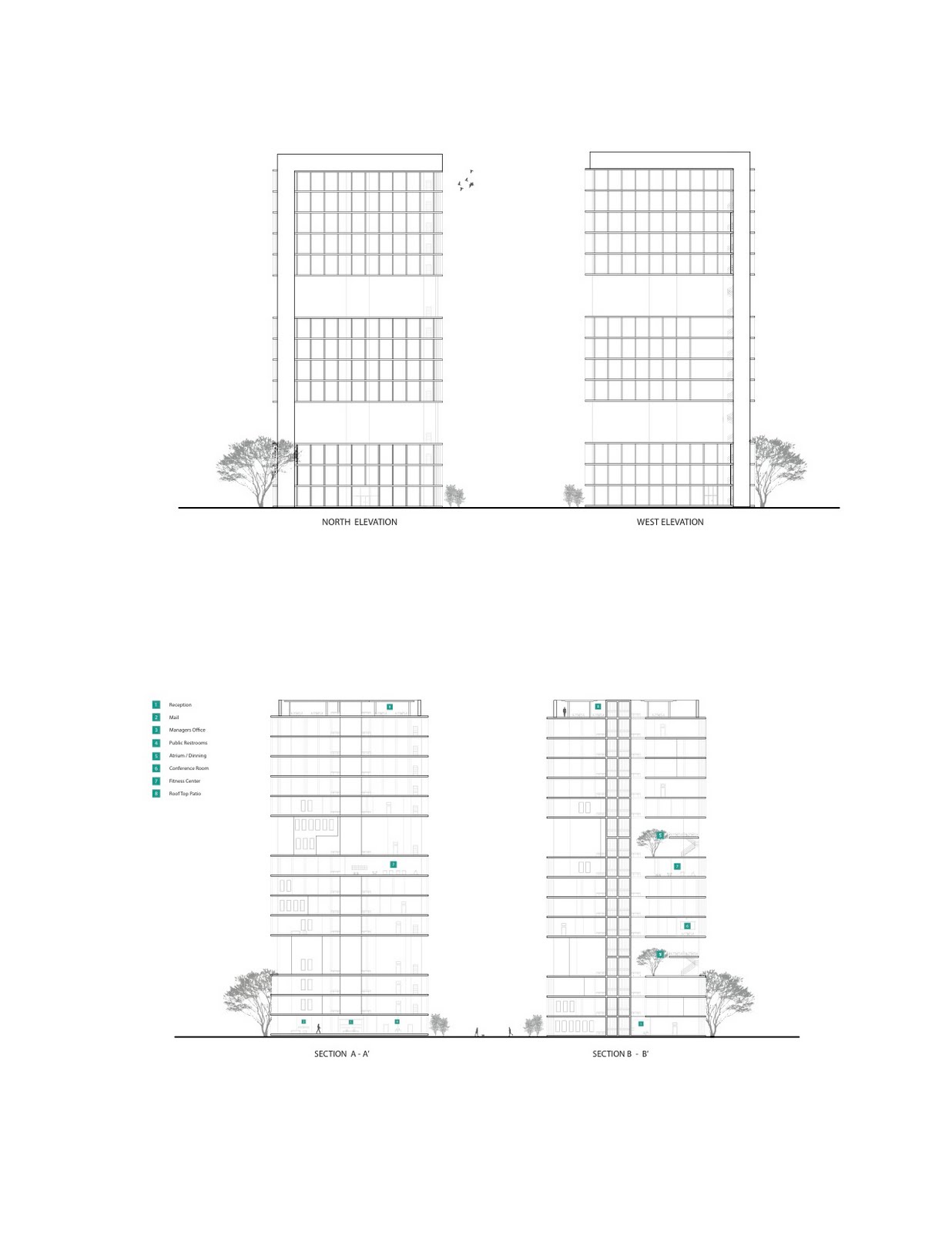
[pic] Working at an individual scale to groups of three, six, and finally twelve, required different scales of communication, verbal and written expression linking all the Jenga projects together, and becoming not only an integral part of the designs required for this semester’s assignments, but also a lesson learned in how both forms of expression must be embedded in all of my own design work. Everybody learns about his or her process in a different way. Although some aspects I had previously charted as integral such as sketching, diagramming, and building models are still very much a part of my processes, this semester encouraged my to incorporate further verbal and written skills, which I must continue to practice upon throughout my life as a designer.
 [pic]
[pic]
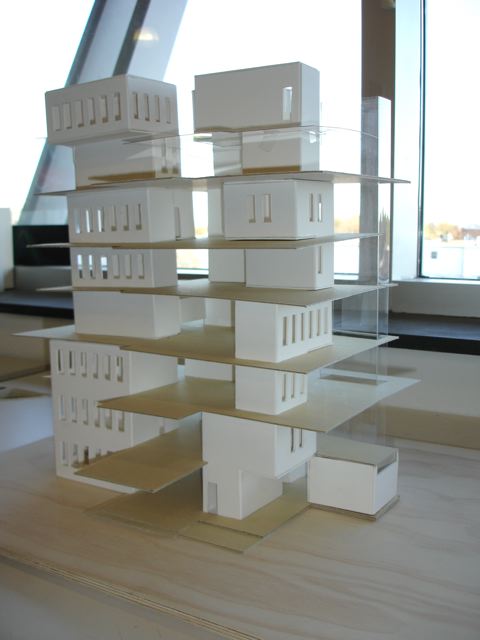
I started out this semester with a shaky approach on time management. It was one of my main goals for the semester that I’d like to think I’ve come along way in. Learning many new skills while producing deliverables at a fast rate was a great challenge for me individually in Jenga 1.0 and 2.0. For starters, working in group projects helped foster my learning individually a fantastic amount. As everyone brings their own strengths to the table, working at all levels allowed me to gain new skills. The largest ones skills I improved upon were time management in groups of three, model building and team communication/ digital work in the group of six, and a big step for myself in the group of twelve was learning how to render in sketch-up plug in Podium while balancing group/individual work. There were features that bolstered each project throughout in terms of gained strengths such as hand rendering and Adobe workshop skills, which for the most part I learned on an individual scale, practicing through trail and error to achieve results that I was both proud of and my team members felts strongly standing behind. All in all, through the great amount of group work I learned an incredible amount. To list some things; Rhino, illustrator line weights, digital plans, diagramming, model building, time management, effective communication, and digital rendering were all crucial strengths I learned and built upon this semester with the help of my peers. I am not the same designer I was when I wrote wii-1, I believed my skills have changed dramatically in the past three months. Hard work at a fast pace pays off, especially when I can look back at the work I have completed this winter and spring and clearly see the improvements and strengths I have gained. All the way through this journey my classmates and I have been required to reflect and contemplate design in our writing, just as I am now. The last line of my essay on initial goals was “to reach an equilibrium in strengths of my ideas, results, skills, and designs”. Although I realize now that this is a never-ending goal, I feel a great jump closer to a unified designer coming out of IAR 202 this spring semester.

[pic] "Trotting away with a whole new mind of growth"


