Rituals in space: Design a studio for an artist or designer using an already constructed space including a space to rest, eating/dining/food prep, bathroom, and floor/ceiling change. The artist i choose for inspiration was Pop artist Peter Max, and my space was the administrative office in the studio arts building of UNCG. Below is my process throughout this project.

At first as a group other IARC students and I measured the space, above is the rough version of a plan jotted down in my sketchbook.
From here we started our first iteration of plans and elevations of the actual space, uncontrolled by our designs at this point, i apologize for the fact the drawings are hard to read...I blame it on the pencil, there is an extent where photoshop can only be so magical in creating more contrast in pencil drawings, especially.


Tracing paper plan of my initial idea of how I was going to change the space.
INITIAL SKETCHBOOK IDEATIONS
For me, personally in order to start designing I must jot down any and every idea that comes to mind, whether i sketch it or write it. Below are my initial considerations regarding how I would change this administrative office space.

A few questions to be addressed...

Concept # 1. My space would be focused on the studio space, making it large and open in thinking that this space was the true purpose of the artist to reside here to begin with.

Ideation of room for easy ideation in the space. I originally wanted most wall to be coved in dry erase board to allow ideas to be jotted down at any time or place within the studio.

This wall divides the space yet keeps an openness through its filtered nature from this precedent i was inspired to make the filtered wall storage below, taking this photo above, adding thickness and a grid to form shelves, shown below.
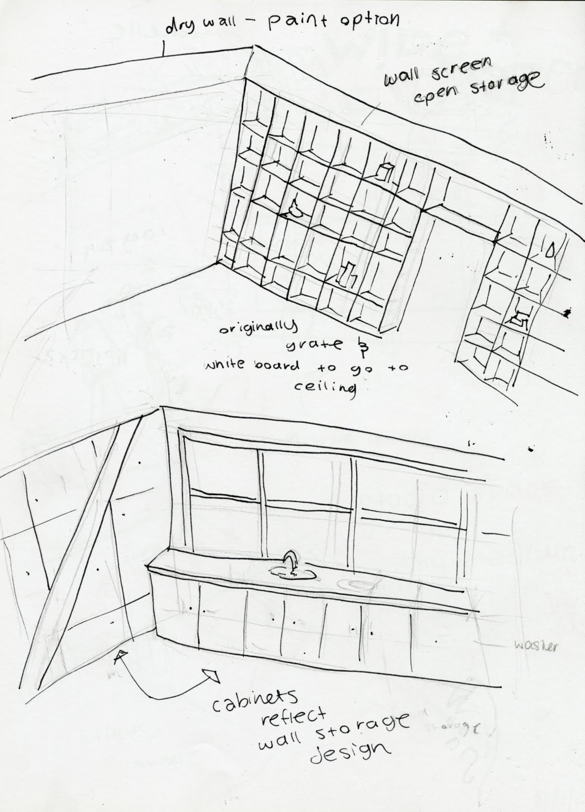

Staircase ideas...the pictures included in these sketch book {above and below} were very cool. I loved the below restactable staircase however as it fit into a wall of concealed storage eliminating the large amount of space a staircase typically takes up. I liked it so much that i used it in my final design to maximize the space.

First Iteration of perspectives...


Kitchen/Dining area ,concealed storage shown in bed bath area shown here as well. I felt that since this is a studio space, bar seating would be more space efficient than a table. In order to store the retractable staircase {seen on the wall with the diagonal stripe of color} the wall would have to be about 2.5 ft thick. At this point I though the concealed storage that surrounded the ladder-staircase should be accessible from either side of this wall, although the ladder-staircase could only be pulled out on the bed/bathroom side.

Multiple private activities going on in a single space sheltered from the office by a single curtain wall.

Office/ work space area showcasing the white board wall i planned to place on any and all of the larger walls to allow the artist to sketch and/or produce ideation at any given place without having to search for say a sketchbook..or napkin {I have personally ran into such a circumstance} Idea boards filled with idea amongst the space. Since this space was not planned to be an extremely private area, I did not want my artist to be separated for the studio/painting area of the space by a full wall. Inspired from the picture and notes in my sketch book in the above page from my sketchbook, I decided to incorporate this filtered storage wall that gives a separation of space while still allowing one to see into the next room {studio space}.


Elevations upon elevations, when change comes about.. {drawings must follow}


In greater consideration of the ideations above i decided to change the original ideas and plans in order for the artist to use the space in a more efficient way. For instance, in the above drawings and plans, you can notice that the office space is huge. When stepping back I found this was ultimately an unnecessary use of the space I had, my artist is a painter so I thought I should give the studio the maximum amount of space possible. I also made the choice to privatize the bathroom more in consideration of a variety of circumstances deeming my more open bathroom, sheltered only by a wall screen seem a bit too open. Below is my process of how I came to the final plan and studio entirety.


Playing around with many different floor plans to get some more perspective on how the space could be used..

The computer rendering program sketch-up is most definitely a helpful tool in putting yourself in the space. For example, I decided to make the filterd wall a more abstract design instead of squares all the same size. Sketch-up gave some light to the idea this design would be more visually interesting. My sketch-up renderings were more of a frame for my hand renderings which i personally think have a lot more character to them. Regardless I plan to become much better this program by training my self this summer so I can develop a greater sense of the spaces I design.


The Final Board, my layout was carefully placed to guide your eyes across the given information and take you through the space left to right, first understanding the plans and elevations and then being able to relate that information to the rendered perspectives and details. The colors are bright as my artist is Peter Max, famous for his use of "psychedelic" colors, bold in their compositions. I put in a super graphic simply consisting of scattered dots similar to some of the splotches Peter Max has used on the sides of his paintings, simple enough to not take away from the drawings. Dealing with the brightness of the renderings in comparison to the stark nature of the technical drawings was my biggest challenge in organizing this board. Spread the vibrancy!


Below are the final plans and elevations


Rendering these bold palettes was also a major challenge. I am used to saturated and heavy rendering with markers ( My medium of Choice) , and not leaving as much room for the looseness I wanted to depict in my drawings. I felt that with my bold pallette a more complete rendering of the soace would look just that; heavy and saturated. I attempted this various times and I wish I had gotten to do so even more as my perspectives leave much room for improvement. Throughout my process however, I believe these final drawings are a few steps up from where I started.

A detail drawing of how the retractable staircase works, fitting into the wall of triangular concealed storage, sliding along track on both the ceiling and floor when out.

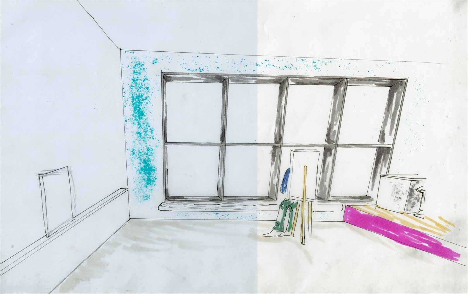
Lofted area perspective along with a pop-art inspired color palette.

My scale figure is climbing to the loft space, this perspective showing the below area where a computer rendering desk across from the filtered storage wall resides.

An open studio space, a step up to an open kitchen to be used for cooking along with enough countertop room to use for art purposes, as my client was a painter I made sure the sink for instance was large and easy to get too from the working space.

My design revolved around two aspects, keeping the studio space large for the possibility of work in a variety of mediums, and using storage systems to allow this space to be open and uncluttered by supplies and other personal items that the artist would have in their stay here.

This wall became the only one to incorporate the original plan to include white board everywhere. With a little research I found that porcelain is actually a much better choice for dry erase markers because it does not stain over time like dry erase board tends to. A wall for ideation to occur as well as a ledge to place work upon.

Kitchen, filtered wall with opening to loft and office, bathroom set back excluded as a more private space, and private entry {solid door opposed to glass door for public entry tells others of its more private nature}
Overall this project was a fantastic learning experience.Although I will still defend some of my propositions, I think my deign could of used alot of development, given more time. Going through this I found that you absolutely must keep stepping back from your initial ideas to better your design. I worked very hard to achieve my final product, and although I am happy with it, I could not say I am completely satisfied which should be interpreted in the light that I feel even more betterment could have come about. Project development takes both time, and the ability to not get stuck on any one particular idea. Some big changes would have happened to this interior if given an extra week most likely , but regardless, life has deadlines which we all must meet so at a certain point you have to go with what you have..As a designer I hope that in my future, I will allow more time consider any and all possibilities that can make the human experience in any given environment, a pleasing one.
