Showing posts with label IAR 222. Show all posts

Saturday, December 11, 2010

Counterpoint: Machine


For my final counterpoint project on a 8.5 x 8.5 canvas as always, my final pick was a paragraph about a building. The IBM tower in a way is a symbol for a future continuance of sustainable innovations. Dubbed a "business machine" this building is well suited for the explorations unit.

Friday, December 10, 2010

Point : Explorations

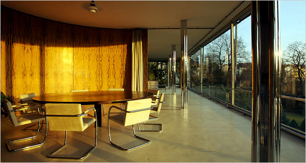
The explorations unit takes a stand as an ever-changing expressions eventually turned into a sort of paste to slap on whatever decorative ideas come to mind in an half hour tv special. The beginning of this unit did not start with the rise of HGTV however. Some of the most renowned styles especially in American architectecture we still can see now in major cities like New York where Art Deco structures stand solid in form through examples like the Empire State building. Lavish surfaces compiled with symbolic meaning of making ones own fortune and the rise of industry invest an incredible amount of solidity to structures like the Daily Express building whose exotic materials and shiny surfaces only add to a vision of glamour backed up by an ever-growing film industry. In an opposite response to all of this glitz and glamour, Bauhaus or International style rose in the early 1920s to settle problems of excess and functionality that had plagued buildings for centuries prior. The introduction of new materials had already come into play long before this movement, but with the exception of art neveaux interiors, never had steel been celebrated so blatantly without reference to ancient Roman form. Marcel Breuer’s Wassily chair is a supreme example of a product fresh out of the international style which “ emulated the lightness and strength of the bicycle form in choosing tubular steel for the construction of his cantilever chairs” ( 75, Massey). This rejection of frivolous add-ons inspired one of the great residences of the time to come into being. Spoken highly of in my reading comprehension 7 response, is German architect Ludwig Mies van der Rhoe’s Tugenhat house. While still keeping a steady blend of lavish materials and functionality in its design, the Tugenhat house bridges the gap between surface and substance. On the same spectrum but very far away in my opinion is another minimalist response called Villa Savoy. Le Corbusier’s work explains the notion of functionality in a minimalist approach, but remains cold and austere throughout its surface. Softer modernism like Alvar Aalto’s Villa Mairea brought in much more wood accents along with curvilinear forms that brought warmth to the home perhaps because their contrast was not as stark as examples like Villa Savoy against their outside environment. Sculptural modernism seen in Eero Saarinen’s TWA terminal in the JFK International Airport take literal examples of taking flight to a new level leaving only gravity to define what are walls, ceilings and floors are. Whether you like them or not, all of the building’s above could be considered successes of their time, but not all modernist building could be considered in such a high esteem. As TWA airport successfully conveyed monumental symbolism Jorn Utzon’s rising shells on the Sydney Opera house did not function as intended. The acoustics were completely off turning a $131 million dollar project into a $400 million dollar one, bring truer the question if modern architecture could express its character while still achieving the principles of commodity and firmness. With this in mind, the Post-modernist era came at hand bringing in three major realms; Historic Preservation, Regionalism, and Deconstuctivism that attempted and are still attempting to figure it all out. Computer technology was founded making the framework of Frank Gehry’s Guggenheim in Bilbao Spain possible. “Suggesting that fundamentally, a building exists as an isolated abstract phenomenon” (600, Roth) many deconstructionist buildings disrupt the traditional way we look at architecture. All of this is made possible of course, by the rise of technology. Historic preservation recalls returning to the old. Regionalism promotes forming buildings to their site without any search for international commodity but rather local. In the end though, all three approaches take sustainability into account. As citizens concern towards renewable resources grew in the past decades, buildings adapted too in order to lessen or eliminate excess of buildings. Architecture is meant to support and facilitate the human community but can only do so if it reaches three expanding principles. From the ancient Egyptian pyramids to the IBM tower, the elements of architectural perfection trace back to Sir Henry Wotton’s conditions of commodity, firmness and delight. These interpretative conditions cover architecture through out the years past, present and even my own future design work to come.


I choose the image above as an interesting example of historical preservation piled with a deconstructionist approach, the glass almost looks as it could fold down into a flat pile while its base remains sturdy and heavy in materiality on the ground.

Friday, December 3, 2010

Reading Comprehension 7


In this diagram of John McGriff’s “Trucks at Rutkowski Farm “ I highlighted the diagonal elements of its composition and pop of color. The painting is divided into three major sections, the group of three diagonally oriented cars, the foreground, and the diagonal horizon. Another piece in the Town and Country section of the Greensboro Collects exhibit that is oriented much like this with shifts in its diagonals is George Tice’s “Two Amish boys, Lancaster PA”. Like many of the works covered in the explorations unit, this painting is a response to new vs. old in an awareness of surface and substance. Although the foreground and horizon are beautifully depicted, the greatest substance of the work lies in three diagonally oriented trucks with the greatest emphasis on the red truck closest to the viewer. The detail in the depiction of light on the red truck creates the heaviness that emphasizes its appearance as the central point to look at along with being the most contrasting color in the scene. Like the context of the painting, in an architectural sense this substance is “more than simply a benevolent provocative umbrella; at its best, it interacts with us on our behalf, informing our memory, allowing us to become more human” (612, roth). This diagonal element of these seemingly well loved or “old” trucks upon a rural landscape leads our eye to a building in the distance, situated in line with the blue truck that is farthest from the viewer blending into the horizon. According to Roth, architecture is “the built record of our priorities “ (roth 612). Relating to this idea this building in the distance in relation to the old trucks is how the artist addresses the conflict between new and old, in a bleak reminiscence of how this rural setting was taken over by other priorities in this case the replacement of farms with poorly planned housing developments. As this work is in a way an expression of how bad architecture can fail on a landscape, it brings truer the statement that: Architecture is the art we cannot escape”.

Wednesday, November 17, 2010

Reading Comprehension 6

1.
Rolling into the twentieth century, all types of new inventions were on the rise. One developing in this early part of the of this century in particular was the automobile. Not only did the invention of cars affect the way people traveled, it also claimed its influence in art and architecture. This air of movement can be cited in the post-impressionism genre labeled expressionism and as well as the architectural style Art Nouveau. In the works of Kandinsky, we see an expression of free form movement, though not identical, still coincides with the ideas floating around Germany, Belgium, and Paris at the time through various structures. In Belgium, Victor Horta’s Tassel House captures great movement largely through the incorporation of a network of ironwork left unexposed in a celebration of the relatively new industrial material in the way of a seemingly vine-like lines continuously whiplashing throughout banisters surface decoration and supports. We see a similar “whiplash movement” in the ironwork winding through the staircase and hall at Atelier Elvira in Munich, designed by August Endell. This iron work is just as must an expression of movement as the work of Giacomo Balla in Italian expressionist art. A more geometric piece of this artist that incorporates free form movement along with contained form is his piece “Canto Patriottico a Villa Borghese”, easily relatable to the ironwork at the entrance gate in the Castel Beranger apartments in Paris. Kandinsky’s “Last Judgment”
follows through with incredible motion; guiding ones eye across the canvas much like the fluid movement in the ironwork seen in Art Nouveau spaces at the time. Even taking a larger step away from the organic curves of the art and architecture fusing above, in Berlin, Henry Van der Velde took on a more geometrically moving pattern at the Havana Tobacco company cigar shop. The pattern weaving along the wall is an abstract interpretation of the sweeping and curving of cigar smoke. An expressionist artist at the time, Marcel Duchamp also abstracts the literal in his work like “Portrait of A Chess Player”, coinciding with this shop. This German take on Art Nouveau was known as Jugdstl or “young style” (Massey) bringing about a new approach to design for the new century. To say one was influence by or before another is an impractical approach in my opinion, for at this point in the early 20th century the air of movement was winding its way through all levels of design. “To an even greater degree than others before them, Art Nouveau designers see no separation between the fine arts of painting and sculpture and architecture and the decorative arts…They strive for unity in design to create complete expressions or what they call total works of art” (Roth 485).


2.
Within the broad statement “less is more”, a plethora of boundaries can be applied and tested. The implication of words ”simplicity” and “less” often times give off a message of affordability for some. Regardless of this opinion, the modern movements in design and architecture in the 20th century more often than not implied that this simple, good design should be for everyone, the underlying statement being everyone that could afford it. A prime example of luxurious simplicity in the early 20th century is Mies van der Rohe’s Tugendhat House in Brno (1930). This house was imbedded in simple, yet lavish surfaces like silver-grey raw silk for the curtains, wool rugs, tan and emerald green leather furniture and marble dividing walls. Even with luxury imbedded in its surfaces, there was little to no surface ornamentation, but highly technologically advanced (for the time) artifacts such as a seemingly simple glass window that actually retracted into the basement like a car window with the push of a button. In the case of the Tugenhat house, its simplicity certainly delivers “A machine for Living” in more ways for its surface. For example, Air conditioning was a relatively rare and luxurious amenity that made up some of this house’s technological complexity that today is standard in houses, whether their surfaces read- Machine for living or not. Unfortunately in many U.S. neighborhoods, only the internal complexities of the home in its “Tugenhat House like aspects” are what is typical. Although there is a movement towards a new opinion of the famous dictum “less is more” the epidemic of garage-centered homes having semi-classical elements slapped onto the surface, continues through the middle class living situation. This poses a different idea; if good design can be for all…who can afford it…or intentionally seek it.


Above, a beautiful work of the past including thoughtful design in both its surface and substance. Below a modern day McMansion. Hopefully not the future of design, thinking only of how the surface appears to the outside. I would be surprised if this was not simply a copy of another, with no great thought even involved (translating into a big house...with little substance)


A view of Frank Llyod Wright's Falling water. He developed his own hue of the vibrate red you see streamlining the windows and in some other furniture pieces seen in the back of this space called Cherokee Red. As the assignment was to draw a modern interior we believed to explode the notion that modern interiors all come together in stark and cold back and white,Meant as a retreat for the Kaufmann family, this interior brings in nature while providing some vibrant hues to an overall relaxing atmosphere.


Monday, November 8, 2010

Point 4 - Reflections


The reflections unit covers a vast amount of amendments to what is considered “good” design throughout architecture history. Spanning from the end of the renaissance to the modern world of the 20th century, evolutions are great, but can be very confusing as this block of time suggests many versions of what is “good” design. Architecture is no longer a luxury only suited to high society as a middle class emerges throughout this time period to add voices to the question of what tasteful design is. From Baroque theatricality to William Morris’s toned down interiors considered minimalist in comparison, there is a countless conversations sparked up throughout the reflections unit that all conclude in three options; revive, revolutionize, or  a morphed combination.

            Stemming off of the Renaissance, the Baroque period took all the classical forms we saw throughout the past only to elaborate and multiply them. At first an effort to bring citizens back to the church via theatricality, the style spread into all types of building forms as we see in the Paris opera where exterior columns are multiplied, and surface decoration which adorns the walls comes in such mass that a certain chaos is born. Toning back all of this chaos, the search for the right or most “tasteful” smile continued in the Neoclassical style, prevalent in much of Robert Adams work in England and also translated to the budding country America. Following antiquity in a simpler form than that of baroque theatrically (which pretty much broke the rules), but none the less accumulating classical forms to buildings like the Kenwood estate, except with a more exact rule system to abide by, especially when dealing with surface decoration. The Neoclassical style was thought to show knowledge as is borrowed of ancient forms, bringing antiquity into the home and other structures of society. A rise in foreign trade sparked an eastern influence in design of the west, as culture was picked up alongside materials. Counties of western Europe had never seen eastern styles from countries such as China, Japan, and India and in turn, imparted these ideas gained through visitation and trade into their own structures, once again adding to this “good” design conversation. By uniting design aspects from the east into their own buildings however, western countries like England ended up with structures like The Royal Pavilion in Brighton, England that look entirely out of place. Borrowing on Indian and Islamic minarets and surface décor, places like The Royal Pavilion were clearly influenced by the ideas coming back from trade routes like the Silk Road.  As new materials were introduced buildings like the Crystal Palace encompassed a certain amount of confusion in their form as a green house like structure housed an array of classical objects. There was confusion concerning whether or not to hide iron supports or celebrate them in a classical form as we see in the French Biblietheque National. The mass production of the industry touched all levels of architecture, down to the artifacts that took up the space of the “modern” homes. At multiple points, even continuing in modern day people took on the philosophy that being surrounded by a lot of stuff would show insight into ones character; a very Victorian point of view. This is yet another style movement at the time, as the industries takes off; good can be manufactured cheaply and in bulk. This meant that the middle class could now afford to collect all of this bric-a-brac and a certain amount of clutter began to characterize Victorian homes. In response to this ranging and overly ornamental style, designers like Charles Macintosh and William Morris added their own input to the great design conversation. Through a style we now dub as Arts and Crafts, the designers attempted to create a singular style focusing on the craft of the buildings opposed to the amount of stuff adorning the walls. Morris’s own home, The Red House has white interior walls that contrast against the dark wood interior for example, with little or no surface decoration. By bringing in the handcrafted touch to his structures however, the price escalated making the movement unaffordable for the middle class at the time and limiting the span of this movement.  The new industry introduced the materials iron and glass, changing the shaping of architecture forever. The question of modernism began in some eyes as far back as the end of the Renaissance, as people began on a quest for the right design. As more people started adding input, the conversation of what modernism is simply got more opinions, destined to be a continually alternating definition throughout time.


I choose this as my photo to describe the Reflections unit because at a certain point, there became so many options one could be utterly confused on which route to take upon constructing a new building. In my own design, I believe in influences although I certainly never want to be in this guys position. By citing specific examples one can clear up the blur that occurs when looking at this unit as a whole.

Tuesday, November 2, 2010

Reading Comprehension 5


Question 1:

For my revolutionary artifact, I choose the Iron and Brass bed (1-46, P. 29 Harwood). As one could say a place like the Crystal palace could represent the industrial revolution in its introduction of new building materials, this bed introduces the newfound usage of these materials at a smaller scale. Iron is malleable enough to bend to create beautiful curving lines as it does across this heart-adorned bed frame and strong enough to hold a roof up. The material of this bed is the cue of a revolution in material usage at all different scales.

Question 2:


ARTIFACT (photo)
This dish made by Frenchman Joseph-Théodore Deck (1823–1891) can be tracked to its eastern inspiration though both it's color and other surface decoration. The influence is quite prominint in this french adapted style when analyziing the red, turquoise, and white eastern stylized flowers sitting flatly on the deep blue background. Inpired by Chinese porcelain, this dish is the product of the designers imitation experimentation during the 1870s and is in fact a flambe glaze look-alike of similar. Chinese artifacts. Such artifacts were so popular at the time that Deck developed a modern soft-paste porcelain concoction so that they could be mass reproduced in factories.


SPACE (photo)
This space in London, dubbed the Peacock Room exhibits a great amount of Chinese influence on western interiors at the time. During this point in the 19th century, the fashionable trend cued for a presentation in the home in order to depict one's "worldliness" to guests. Seen here in the Peacock room, the traditional eastern surface treatments are ever-present. Bringing in lattice work and rich gold eastern ornament such as Chinese inspired painted peacocks, that tie together as they wind across the space. Overall, from the lighting treatment to the contrast of the rich green and metallic gold color palette, the Peacock room takes its "worldly" influence cues from China.


BUILDING (photo

The Royal Pavilion is a building I personally had never come across till my search in eastern design influences on 19th century western architecture. The inspirations are certainly clear in its Indo-Saracenic style that took over a great part of India during the 19th century. As a court for the Prince of Wales, the extravagance of eastern mosques can be clearly matched with the Royal Pavilion. A sense of exoticism being fashionable at the time, the oriental approach inside and out of this building is ever prevalent within its layers upon layers of surface decoration. The minarets are what immediately grabs me into associating this structure with a middle eastern temple. This replication brings eastern influence to Brighton.


PLACE (photo)
This British garden depicts a certain essence of Japanese culture. The influence is clear as Tatton park includes many elements of the traditional Japanese tea garden such as a Shinto shrine and a tea house. The British adapt the Japanese intention to emphasize the natural artifacts like plants and rocks. In addition, Japanese garden's were meant to be experienced slowly, in somewhat of a stroll. Paths and Bridges throughout the park work to slow down the occupant bringing awareness of natural surrounding.

Monday, November 1, 2010

Clock

For my Clock at the conclusion of the Reflections unit i chose the scale of a place in 3D form. Using England as a guide through design movements, the Chiswick House marks an important and different movement in English architecture along with the Kenwood House, Crystal Palace, and The Orchard. The wooden hand in the middle does in fact move, but is meant to be placed at the point in history corresponding to the images. Throughout each of these structures, can can see a blurry reflection of past works and ideals.


Perspective

For the Alternatives unit counterpoint, I choose the scale of a space and put it in the form of word. The essence of the word echo is essentially to repeat. The idea of repetition carries through in the layered vaults of the gothic cathedral but also throughout design history, as the saying goes...


This layered perspective shows the repetition of classical elements, repeated from the Romans and molded into a gothic perspective.

Wednesday, October 20, 2010

Point: Alternatives

In a glance at the alternatives unit, we travel in time through the Renaissance, Baroque, and Rococo periods. When architects sought after ancient examples from the forms that the Greeks and Romans left behind, a new adaptation of classicism arrived in a wide rage of forms. Each society after the 15th century exemplified classical principals and forms in their structures to produce their own alternative revision of classical ideals varying by region and place in time. Man became the measure of all things and the “rebirth” of classicism known as the renaissance arose. Patronage to built works and art was taken on by high societal figures such as popes, merchants, and other wealthy elites who commissioned a vast amount of new architecture in order to give their city’s a sense of delight based on the numerical proportional systems which displayed a sense of intelligence and vestige in a time where knowledge was sought after by looking to the past. Scholars such as Vitruvius wrote the standards of perfect classical form for architects of the time and centuries later to follow, though his own reinterpretation of classical concepts, passed down though time only to be reinterpreted again and again. “Emboldened by their flourishing urban (and urbane) culture, they set out to match the intellectual and artistic achievements of the ancients” (Roth, 353).
Renaissance church floor plans such as Filippo Brunelleschi’s Church of Santo Spirito in Florence were based off of the system originating off of a Roman Basilica. Capturing monumentality through the use of arches, massive scaled Corinthian columns and pilasters were developed by the mathematical proportions, using a great deal of care to achieve such spectacular results. The commissioning of these great buildings was a form of cultural representation often times depicting a show of human accomplishment. New building types became more prevalent opposed to the churches and palaces that reigned over architectural commission in the past. The Ospidale Innocent was a founding hospital, which took on a different “riff” of old forms. Throughout the Renaissance we can see a marriage of past principals given new light such as the basic stacking and layering of arches and columns to develop new ways of thinking about old ideals. Overall, Renaissance architecture was a simple arrangement of, circle, square, and rectilinear forms used in ancient times expressed in mathematical proportion. This concept can conceivably be seen the easiest in the examples of Andrea Palladio. (photo credit)This celebration of human knowledge though, would soon be transformed into dramatic Baroque theatricality, and later, Rococo embellishments as new ways of stimulating human emotions through interiors were approached. In an effort to drag citizens back to the church, buildings took classical forms such as columns, vaulting, arches, and pilasters and teemed them up with chaotic ornament, changing the rules of classism. The visual complexity of structures like Bernini’s Cornano Chapel in Rome depicted a heavy use of art in the form of frescos which created the optical illusion of three dimensions, showing perspective on a two dimensional plane. In Bernini’s churches, the central plan that had been mimicked over and over, transformed into a longitudinal direction, molding the Basilica template in a new exploration. Concepts such as axial arrangement became embedded in French architecture through examples like the extravagant Versailles. In England, excessive ornamentation brought theatricality again in Blenheim Palace, which took classical forms on a dramatic skew once again. The last step away from the heavy architectural elements and rich colors of Baroque interiors was the Rococo movement that began in Paris in the 1720’s as elites moved out of the city and into the county to only spread across many regions of Europe. This response to the heaviness of Baroque style took a lighter approach in its ornamentation through narrower swags, shells, and other nature-inspired décor became curvilinear and delicate. Femininity reigned as a focus on light seen in the light pallets and focus on manipulating natural light itself though cleverly positioned windows mirrors and filigree reflected the idea of bringing the outside in. The regeneration of Architecture is seen throughout this chunk of history, however, this “regeneration: is a concept applied daily in modern times as much as the past. In order to start designing, I often look a past precedents. This is not to replicate these forms, but rather, improve them on my own terms, distorting inspirations into something completely new. Architecture throughout the Alternatives unit used this same approach with classical precedents to develop new styles for changing environments and times. “…These avant-garde architects now sought to create a rational modern architecture reformulated structurally from the ground up in the light of a new understanding of ancient architecture”. (Roth, 435)


I Choose the image below as my description of the Alternatives unit because of the changing adaptation of old forms throughout this bit of time. Mimes adapt to new situations as well, contorting their human form to mimic different characters observed in the past.


photo credit

Monday, October 4, 2010

Point: FOUNDATIONS

Ancient civilizations introduced the foundations of what we know to be empires of progress, passing on knowledge to each proceeding civilization. Across regions, we see architectural development borrowed, improved and elaborated on. Not immensely distant from Ancient Egypt, Minoan Greece incorporates structural columns in the Palace of Knossos in Crete. Design expression in the form of artwork becomes seen vividly throughout structures by tile work and mosaics. In civilizations to come these forms are used to tell stories and advertise retail goods and services to the illiterate mass. Ancient Greece develops a distinct idea of the temple design or first interactions of the megaron and its development. For instance the temple of Hera I (530 BC) has a row of columns in the middle of the four sided rectilinear shape, supported in a post-lintel style fashion with a four sided colonnade lining the outer side, while the temple Hera II (460 BC) advances to two rows of parallel columns guiding the occupant.. Having linier navigation comparable to the hypostyle hall, temple features from between the two societies gives light to cultural and religious differences between the two ancient societies while showing development in architectural form. By and large, Grecian architectural design concentrated on the aspect of symmetry, balance, and order. Creating the perfect proportion in each structure from insights in geometrical studies, this style deemed in history as “classical” was the basis for many of the Roman and Medieval architectural feats to come. Strategies such as building to a scale so monumental, the structure engulfs its occupants in building types like temples, are passed down to each of civilizations following afterwards in the Foundations unit. However, these massive houses of worship mold to the needs and beliefs of the societies constructing them and therefore in no way exact copies, but rather “riffs”. Grecian examples such as the Parthenon could be seen to serve as a kind of template for later societies to style into their own form of excellence. “The Greeks cared little for immortality on a spiritual plane, but rather, they sought to ensure their immortality in human memory…The Parthenon is proof they succeeded in living forever”. (Roth) The basic Megaron was molded as new innovations were discovered, an example being the Roman creation of the arch, which in turn allowed domes and vaulted ceilings. Transitioning from Acropolis to Rome, we see the temple and its basic system of navigation change dramatically as a different culture has its own take on it. The addition of a triangular shaped gable roof and one set of steps opposed to the three equal sided steps of the Grecian temple designate a clear entrance to an occupant. Budding again from this basic post and lintel system though, Mankind was able to create incredible structural improvements as mathematics and play of geometry (symbolism attached) allowed for the “trappings of an empire”. Roman being one of the major empires of progress, some of these “trappings” include the bath, market, aqueduct, villa, dome, road, arch, coliseum, and basilica. Architecture had long since molded to provide basic shelter, but rather conform to the needs of a growing society. Baths oriented to Roman neighborhoods show the development of mankind conforming to what we now consider to be “civil” ; a water united society, rich in learning. The Basilica perhaps was one of the most influential of the Roman designs, becoming a template in itself to create architectural master pieces in the Gothic Cathedral architecture of the high middle ages. Although the overall theme of cathedrals could be considered entirely different than the concept of Greek and Roman temples and Basilicas, the contrast only resides because of the developments made on the basis of the Greek and Roman innovations that Gothic cathedrals elaborated on to create such emphasize on verticality and light throughout the Cathedrals that went up such as Amiens in France and Cologne in Germany. The flying buttresses created at this time allowed the extreme verticality to enter the landscape. Architecture throughout the foundations unit became more innovative taking ideas to build up and out interpreting previous designs in new ways, while still following a similar chain of design elements.

In my own design, I try to step back from all the land statements made to figure out why these altercations took place. Although these ancient societies copied the architectural forthcomings of each civilization prior, no structure is identical from one society to the next for good reason. Molded by developments and beliefs, the concepts of architecture changed in each era of time. I have learned that no belief or design principal should be ignored or possibly just as worse- grouped together. Societies and structures should be analized for what they are individually as each form as a specific story and reason behind it. I must have reason to hide, conceal, build up down, or around emphasizing thee story of design and what it took to get to the final product.


I choose the picture below to sum up the foundations unit as it serves as both a reminiscent look into Roman developments and segway into a different outlook of these developments in a new era. Peeling back the layers of the Florence cathedral, this photo depicts how each innovation allowed this design. The architect Brunelleschi drew back on the foundations of Rome to construct the tallest dome since the pantheon.


click here for photo source

Friday, October 1, 2010

Reading comprehension 3

Below is my colored pencil depiction of Cologne Cathedral in Cologne Germany. Construction dates 1248-1560 & 1842-1880

As the monumental verticality of the cathedrals engulfs its occupants, light pours in sectioned off, mainly through the passageway of arched windows. This “engulfing” could be considered to many as a divine attribute, very fitting for the structure type of a cathedral. The pointed arched windows found in both Cologne and Salisbury cathedrals follow the same verticality along the walls they adorn. Elongated forms, allow the illumination of these buildings in daylight. Light can be viewed as a source of life, which allows humans to produce, and stay warm. At a time when so many were searching for refuge often in the simplest form of having shelter, the concept of staying alive was a main priority many had to work towards, in a day-to-day struggle. This sense of light and warmth could possibly define the “Dark Ages” because of this principal that one needs light to live. The illumination of the Cologne and Salisbury interiors thus, automatically designates the structures as sanctuaries along with being places of worship. Adding to the stretches of vertical windows letting in massive streams of light, from bottom to clerestory, the stained windows often tell a story of their own. Other sources such as candles and reflections from thereof provide a more mystical sense of light and warmth, more indispensable at night. Overall, both Cologne and Salisbury cathedrals center on verticality and light. Light permits life and provides virtue of the divine.

The world did not add a layer of shadows in between the time of ancient Romans fall and the start of the “Dark Ages”. In fact to allow the amazing structural innovations such as barrel vaulted ceilings and flying buttresses to arise, the collaboration of many laborers was necessary in its development and construction. The designers logically would be higher up in social hierarchy in comparison with the many laborers. This is in assumption however, that such structural innovations were well thought out, requiring an educated designer, not just the makings of some “happy accident”. Although many were fleeing for sanctuary in the “dark ages”, some of the lucky individuals had the blessing of structural enclosure. The time that wasn’t spent preparing for the daily grime was allocated to great thought, perhaps enough to develop such structural strategies. Popping up in a time that has been looked at so drearily in history, we must observe aspects of the Cologne cathedral such as the ceiling in comparison with the vaulted ceiling at Amiens to look at the validity of this idea. The technological innovations in architecture seem to cross-regions without extreme alteration. Though we find more distant variations in the more elaborately adorned flying buttress at Cologne computed to its French neighbor (Amines). A focus on intricacy is more of a style change I would note as the most contrasting element between the two churches. The over-all compositions of the cathedrals show regional distinctions in style. As the result of taking a more artful approach we may easily see aspects such as exterior details that depict distinct styles. Their main contracting element once again being the level of intricacy, the Cologne is the cathedral, which takes on a more elaborate language. If anything, this showcases the great thought that must have been involved in creating these structures at a time we now consider to be “dark”.

Cologne

Amiens


It would be easy to suggest that a reiteration of a classical form such as the dome in Duomo cathedral in Florence suggests a degree of change leaning towards the beginning of the Renaissance as we correlate forms between historical periods. The circle as we know it, represents the divine form, appropriate for a place of worship as it symbolizes such perfection that man could not create. Perhaps this bold move in architecture was a calculated one based on the knowledge of Roman symbolism behind certain geometric forms. The cross of Cologne cathedral carries a human centered approach in the language of antiquity according to this belief. If all knowledge is based on the past we could regard that the forming of Cologne cathedral having a more humanistic core in comparison with the Florence cathedral was indeed purposeful. The architect Brunelleschi of Florence cathedral however, did in fact study ancient Roman architecture for a period before designing the dome, ringing true the idea that a skyward centered church was an intentional and past rooted creation. We see this shift without question when comparing the Cologne and Florence cathedrals’ crossing. The whole form of the Florence cathedral could be considered much softer as the result of these curves and a more prominent use of shingles. The Cologne cathedral protrudes as a defining landmark to it's city as well, but in a much different fashion of boldness. Instead, the spiky towers are more on the side of poking the sky along with protruding. Although both Cologne and Duomo cathedrals are astonishing masterpieces, they speak very different languages in terms of their design.

Plan-Cologne

Plan-Duomo


Imagining out of the various forms of domestic medieval Architecture that this woman depicted was working in a castle, we can assume a variety of attributes amongst her interior environment based on the information mainly provided to us my Harwood. The windows at this point are probably relatively small out of concern for safety. We might find some fabric wall hangings as these textiles travel easy in a time of consistently seeking refuge. Firelight torches and possibly some candles provide light and warmth in this space. From the looks of the given photo, the walls are whitewashed and the floors are made out of some type of dirt or stone. Judging by the outfitting and action being performed of this woman (working) however, a fabric hanging would be the possession of a wealthy master.

Monday, September 20, 2010

Egypt-Greece-Rome Summary

Below are some major ideas from what we can see today of the Ancient Egyptian, Grecian, and Roman structures and artifacts.

The permanence of Egyptian architecture is astounding, as its monumental presence can still be on looked 5000 years after when we believe structures like the pyramids existed. In a society focusing on the eternal after life though, it makes sense to some degree that we still have evidence of their presence today. The main lessons are the preservation of the building, which holds simple principals like stacking, developed to be able to penetrate the sky in an attempt to reach the heavens on earth. The post-lintel system also used by the Egyptians carried in through in not only holding up their structures, but also filtering light, and in turn controlling temperature through the development of the column. (Example: Hypothstyle hall) Scale-wise the ancient structures were massive using mainly stone. Artifacts left behind like furniture were made out of wood protected and existing today perhaps only because of the lasting structures that preserved them.

The Grecian culture focused on finding the perfect balance and order. More stylized columns were developed out of stone to support the post-lintel system seen in many of the monumentally scaled temples. (Example: Parthenon) The study of mathematics is evident in their building seen in their attempts to achieve this perfect balance and order, especially through proportions. The corner columns of various temples are even thicker than others to create the illusion of balance from the perspective of an on looker coming up to the temple. The Greek art preserved today shows much more humanistic figures than Egyptian art but still was used partially to depict actions and stories.

Ancient Rome took the Greek structures they observed and garnished and advance d many of the forms. A great example of this would be the more elaborate of the column orders; the Corinthian. The Romans achieved many feats such as the arch, which changed architecture then forward. Focusing on symmetry, balance and order, the immense scaled temples, bathhouses, basilica, coliseum, aqueduct, domes, markets, and villas are all productions of a culture seeking perfection. Artwork found in the form of mosaics was often colorful and meant to advertise, tell stories, and hold symbolism.

Tuesday, September 14, 2010

Reading Contemplations (comprehension) number two

1. Throughout my years in school I have never heard the idea that Greek architectural elements, when broken down and examined closely could represent symbols of sacrificial practice. However, this is not to say in any way that this proposition should not be entertained as valid given Hersey’s argument. In his opinion, just about everything in the Greek temple as we know it holds a symbolic undertone dealing with the process of a sacrificial ritual. He cites the tryglyph as representing the 3 different parts of the femur (a bone kept after the sacrifice), the wrapping around the base of columns meant to represent how the sacrificial animal’s feet were bound with rope, moldings and ornamentation representing teeth, and the list goes on, as just about every element represents a part of the body. With no previous experience upon considering this notion before, it is problematical to determine whether Hersey’s argument is in fact valid. Textbooks such as Roth’s Understanding Architecture only touch upon the concepts of Greek architecture being a balance between lift and load (vertical and horizontal elements), action and rest, all sculpted to perfection using the best materials available. Although looking at elements such as the capital of a Greek column (ionic and Corinthian to be more specific) and viewing them as head garlands, hair and horns is a fairly reasonable thought to entertain given my own previous knowledge, or lack there of-Greek sacrifice. Perhaps one of the more convincing arguments Hersey proposes is that tracholion and hypotrachallon derive from the Greek word for throat. Hersey notes that the head/skulls of the sacrificial victims’ were possibly exhibited atop wooden columns. One could see upon their reading alongside visual components that the capital of the Ionic column for instance could have been more than merely crafted scrolls and curls, representing the horns of an animal sitting atop the column for display given my knowledge that pagan religions were not necessarily foreign to the practice of ritual sacrifices. When reading Hersey’s arguments given the visual components he provides, it is not difficult to acknowledge his propositions as quite possibly valid, despite the fact that without any other research on the madder it is challenging to determine the true validity of his argument.


2. As the result of today’s quick and easy access to information, many times invalid or misinterpreted information is conveyed without a second glance to the concern of the true accuracy of the gathered “facts”. People do not inspect the information they happen upon as closely as what is necessary, possibly because the word is written. Upon creating a context involving people, places and things, a sense of actuality is often taken too seriously even without multiple sources on the given subject to truly establish its validity. In the case of the character of Carson in McCaulays Motel of the Mysteries, a story is recited that is entertaining, but lacks the cultural context given its topics needed in order to be recognized as valid. To avoid such shaky territory one cannot simply rely on merely one source of information, especially from the Internet that spans such a wide web of “facts”. In order to create a valid argument, one must avoid the gaffe first by using multiple sources, moreover sources from all different mediums, including recognized books and journals, in addition to Internet research.

3. Protruding from the earth, the pyramids at Giza are massive stacks, which display the eternal life of the pharaohs Khufu, Kafre, and Menkaure. The massive scale, and visual solidity certainly demonstrate the onlooker the pharaohs’ highest rank in society, nearest of the statues of a god in Egyptian society. Rising high in verticality, these pyramids stand pointed to the heavens as to emphasize the pharaohs communication an connection with the God(s), Queen Hatshepsuts funerary temple takes on an entirely opposite approach to eternal life, laying amongst a mountain in great contrast to the tombs of the rulers before her; the pyramids that seem to penetrate the sky out of nowhere. The queen’s temple accentuates its horizontal components instead with opening aligning its front, adorned with a ramp protruding from its center. This is a sharp contrast to the pyramids that seemed to have no entrance, no deviation in form as to lessen the heaviness of the structure or welcome any onlookers. The idea that Queen Hatshepsut’s tomb is a more welcoming structure in part to its array of openings deviating the heaviness of its mass could quite possibly reflect her role as a woman in Egyptian culture as the opening s and ramp invite the viewer in awe, rather than strike their senses as the pyramids do from their impenetrable mass.


4. Although separated by the Mediterranean Sea along with a place in world history, Egyptian and Greek civilizations share many similarities that we can find in their design response, specifically in the construction of their sacred temples. As expected in different civilizations, the Egyptians and the Greeks formed entirely different cultures. We can see their cultural differing reflected in their building forms. In the words of Roth; “ The Greeks cared little for immortality on a spiritual plan, but rather, they sought to ensure their immortality in human memory, through their intellectual and artistic excellence”. In the essence of this quote, the Greeks couldn’t have been more contrasting in their values than the Egyptians, whose primary focus in life was the idea of the eternal afterlife. When analyzing the different temples produced by the separate cultures however, the Grecian Parthenon and Egyptian hypostyle hall, we can see some merging in architectural style. Looking at the plans of the tow buildings, the similarities appear at the center of the structures. Both temples include a post-lintel construction, but more importantly both the Hypothstyle hall and Parthenon include a set of parallel columns in their hearth, which lead up to a more enclosed, thus more spiritual area. Contrasting, the Hypothstyle hall includes many more columns actually encompassing the parallel set in its hearth. This aspect creates a much darker atmosphere coinciding to the differing religions of the two cultures, as the less lit of the two structures was built by the one which focused on the afterlife…a relatively dark subject. In comparison to the Grecian culture that worshipped the gods for whom hey believed to have allocated their blessings in life, the Parthenon only has two extra layers of columns filtering light from the centralized enclosure. This does not mean that this center was any less holy then that of the Hypothsyle hall, for in was supposed to lead up to a great statue of the goddess Athena who was adorned in gold. This greater amount of light was necessary in order to reflect on the statue, creating a gleaming and divine presence. As the Parthenon leads the worshipped to an enclosure of light, the Hypothsyle hall leads the worshipper to the darkest part. A last important element in this illustration is the idea of the enclosure, guarded by layers of columns. Each layer peels back a more private space cued by the columns creating a holier realm within each realm, in the case of the Parthenon a lighter space of worship, Hypothstyle hall having a darker sense of spirituality.


5. Egyptian culture kept the underlying theme of eternity throughout just about everything they left behind. In turn the pharaohs left their permanent mark on society. Thanks to this concept, we can observe the remnants of this “eternal” culture they left behind. As the pharaoh’s tomb was meant to last forever, the heavy structure consisted of what Napoleon deemed to be enough material in the three pyramids at Giza “to build a wall 3 meters high and 1 meter thick around the whole of France”. So why would the ideal of eternity not carry through as strongly in Egyptian furniture, which was constructed out of wood? Quite possibly they valued the structure more than its interior furnishings, aware that the structure would be the component of their existence that was truly eternal. One could also contemplate that the furniture was mainly meant for their time on earth and became more of an afterthought amongst the grand scale of the pyramids. The heaviness of the pyramids also maintains strength necessary to be apart of an exterior while less attention was devoted to the interior, as furnishings were less important than the enclosure itself in the afterlife.


6. Depicted on the two urns are two images portraying male dominance over women. Both of the urns show the male figure seated on a throne (maybe a king/god), while on one urn one woman and the other two women stand tending to the seated male. These illustrations certainly characterize a nurturing role of a woman and a more leadership centered role for the man. These reflections of a male dominated society can be supported as Harwood notes that males possess ownership and independence as he notes that women in Grecian culture are “their fathers or husbands property”. To delve deeper into Grecian culture these urns surely support Harwood’s claims along with contributing another piece of evidence that the Greek culture was a male dominated one.

Wednesday, September 8, 2010

Point: THEORIES

Transitioning through time, theories of architecture have formed just as humans grew into being. Starting at the core of basic human needs, shelters such as Terra Amata, the Homo erectus dwelling excavated in Nice, France represent the earliest known dwellings constructed by human beings. Built to provide a necessary living environment for gathering people, these basic requirements for human living quarters would expand in the centuries to come as human’s basic needs in their architecture would become as complicated as the people themselves. For in the beginnings of man, basic function was the prime reason for containing people within a space, as we must have shelter to prosper as human beings. In the words of Louis Khan “Architecture is the unavoidable art”. Although even in primitive times, we’ve learned that art in its very beginnings is much more than décor, as the quest for survival ranked first on the list of early natives concerns in their structures. At the very beginnings, spiritual undertones ruled people’s daily actions. However, it seems that when basic needs are met even the earliest of mankind took pleasure in what most of society does today. As mankind gained greater control over the materials of the earth which surrounded him, structures began having more and more specific uses to consent to these aspects of life such as eating, drinking, musical and other performance, and material goods that we enjoy in modern time alike. Architecture started to cover more than mankind’s basic need for shelter and the concerns for longevity against the elements aesthetic concerns, and the ability to control human interaction in the made space brought the biggest movement in history in terms of architecture to our knowledge in modern day.

Architectural critic Lewis Mumford once noted that; “the greatest problem of the architect is to mold the essential structural form in such a way as to perform all the purposes for which the building exists.” Shifting from the point at which human beings were able to spread their concerns beyond the basic ideal of staying alive, Architecture became an elaboration of the concepts that became issues the same time at which people decided to live together. The idea of architectural happiness arose and Sir Henry Wotten established the notion that good architecture “hath three conditions”, these conditions included commodity, firmness and delight. The Romans surely excelled in terms of Wotten’s definition of firmness as we see the ancient structures still standing today. However, buildings of modern times do not invest in that kind of economy or management of resources (by economy- referring to the Greek meaning of nemein which means to manage). Rather we have been testing out new materials throughout the past century most specifically in hopes that they will too stand the test of time. For when new ideas fail as the John Hancock Center in Chicago did when it could not stand the lateral pressure of the wind, we learn and rebuild accordingly. This is where my understanding of architecture comes in; we build to fulfill our needs, and when the architecture that encompasses our daily lives does not harmonize with our own agendas, we rebuild. I must learn from my mistakes in studio, specifically when building to see what does and does not work. The only solid sources of wisdom I can gain is from mistakes of my own and others throughout history. “The Hidden Dimension” depicts how crucial it is to step back and draw from history, as all people across the globe are not alike. This reading suggests that different cultures experience space in different ways, a concept demonstrated though many historical precedents I have read about as the structures’ vary greatly from the east to the west just as they do from the north to south. Through this reading one can find that the variation has occurred since the beginning of mankind just as mankind in its entirety is made up of a variety of cultural differences. The best I believe, which is a major task in and out itself is to be able to understand at this or any point, the idea of true accommodation and its shifts concerning every aspect of the inhabitants, place, purpose and time.


BIBLIOGRAPHIC CITATION:
"taj mahal." Bollywood Food Club. Web. 8 Sep 2010. .
[NOTE: Italicize "Bollywood Food Club"]


PARENTHETICAL CITATION:
("taj mahal")
Mumtaz

I choose the Taj Mahal as my image to describe the theories unit. This elaborate and outstanding structure has stood the test of time, its commodity still prevalent as it is in use still today. This ornate structure is indeed beautiful at the expense of its modestly but as Roth notes; "A modest structure for a modest cost would have provided durable and hygienic protection for the mortal remains of Mahal and Shah Jahan. But by spending more- by some estimates, about $8 million-Shah Jahan got the Taj Mahal. It has rejoiced the world ever since. Surely this was sound economy. Our test should be similar. The most economical building is the one that promises to give the greatest total pleasure for the price.".

Tuesday, August 31, 2010

Reading Contemplations (comprehension) numero uno


I. Select an object or a building from any time period that you believe meets Wotton’s
definition (as cribbed from Vitruvius) of commodity, firmness, and delight. With an
annotated image, take care to EXPLAIN the ways in which you see the definition
realized through the object or building. Use design language and concepts discussed
in class for dealing with precedents

Alvar Aalto's Vippuri library/auditorium certainly meets the standards of Wooten's definition of commodity, firmness and delight. Focusing on the auditorium section shown in the picture above, the space is designed to be an acoustic masterpiece. Using relatively new-to-the-time materials, Alto dequises the techtonics of the structure with an undulating wood ceiling creating a softer approach to the modern design that could have had a completely different rank on my scale of architectual delight had its mechanics underneath the wood been exposed. The use of the wood material creates a whole different feel to the space allowing the occupant to emerse themselves warmer environment less sterile than simply a concrete and steel room. The repeating curves of the ceiling create a wave that descends throughout the auditorium which establishes a means of hierachy throughout the space as the room an its entirety needs as much attention from the front as it does from the back. For instance, an occupant listening to the a performance seated in the back of the space deserves to hear it the same as they would had they sat in the front and vis versa. Following the wave takes the occupant in a streamline throughout the space as a whole. This gliding movement of a natural material makes for a pleasing vision of the emersion of the outdoors with the indoors, ranking high on my interpretation of delight. Of course the addtion of the wood is completly nessessary though to create its high condition of commodity. The undulating wood ceiling is a main acoustic benefit to the principal function of the room as an auditorium. In conclusion, the building stands and has no major stability flaws to my knowledge therefor Wooten's condition of firmness is checked off.


II. Working from Harwood et al’s concept of cultural precedents, select one of the
contemporary textiles illustrated above and PINPOINT the influences you see from the
eastern world on the production of fabric in the west. Concentrate on motifs and
patterns provided in Harwood’s text


The farthest right textile, which depicts a series of overlapping spirals and wave like forms (similar to what people would now call paisley) are part of a contemporary design whose influences wether known or unknown, actually came from eastern designs from long ago. The roots of the wave and spiral design can be tracked back to the geometric motifs made by the native peoples of the eastern hemisphere. Originally created for function before aesthetic beauty, the spiral and waves motifs could be seen woven into baskets and other small furnishings, many times as storage. The early versions of these designs were inspired by the native's natural surroundings and embedded with ulterior meanings as the spiral and wave combo is said to have have represented rain, prosperity, and fertility across various eastern cultures. Although in todays western society, we simply find this cultivation of shapes a harmonious pattern of which we find visually pleasing rather than symbols to various aspects in the circle of life, early eastern motifs are the original source of many forms we see in moderns textiles.

III. When considering perceptions of personal and social space, Hall and others
suggest that different cultures have different space needs and attitudes. Most
consider that citizens of the U.S. generally feel a need for more space. How does this
play out in the classroom in which we gather for iar222?


As the next McMasions rises in the distance, we become more certain that a new breed of architecture has formed in America. Not that I'm personally a fan of the latest and most popular developments, but they are certainly telling of modern American perceptions of personal and social space, which is much greater than what is once was and even many other cultures today. An outstanding example would be the difference in the average space from the 70s today; 1.800 ft graduated to 3,150 from the 1970s' to 2010. Although the average American home seems to have grown in recent decades, I wonder if that translated evenly into how much personal space was expected/wanted from the 70s to today. One building, or room more specifically causes me to delve into such a subject...for Ferguson 100, built in the 70s could be considered relatively weak in compatibility with its occupant and perhaps be rated even lower on a scale of overall delight felt upon interacting in this room. Both classes I have taken and am currently taking in this room are lecture courses, therefor my major activities in Ferguson 100 include sitting, listening, watching, taking notes, and asking the occasional question. This auditorium of sorts is entirely too compacted to achieve any sort of pleasant commodity with its users, even if all they are doing is sitting and staring (I take notes). At 5'7" , I do not consider myself a gigantic human being, so most spaces should provide necessarily leg and arm room. Unfortunately leg and arm room are completely lacking in this space. I find myself switching between which leg to cross and attempting to keep a still position, arms by my notebook or at my sides in order to not violate my neighbors personal space. When it comes down to it however, just sitting with two other persons on each side of me in a way is a spacial violation we have simply come to accept . To have a face to face conversation with a neighbor opposed to a side face to side-half front combination would be a luxury in this space planning from around forty or so years back, unless one wanted to shift into an entirely new (still uncomfortable) position. As enclosed spaces go, Ferguson 100 exudes a rather compressed dungeon like vibes compared to most classrooms and lecture halls i have occupied in my existence.

IIII. SPECULATE about whether or not there can be an architecture of happiness, as de
Botton writes in the work by the same title. Provide a juicy quote that helps give
evidence to your views from the passage that you read. Include an annotated image of
a happy object, space, building, or place and specify WHY and HOW your example
exudes happiness


Architectural happiness can be achieved, at the same time certain spaces can also cause feelings of uncomfort, sleepyness and even fear. The point that must not be missed in de Botten's text is the discussion of what magnitude architecture can effect ones mood; say if you are already have the blues. Spaces can certainly shape how to feel to an extent, but not how your day goes. However, certain objects, people, and places can provide a sanctuary of comfort to us. Take for example the chair one sits back in and first relax after a day of pent up stress. If this becomes your favorite chair and has that certain association attached to it, the design of the chair can only add to its happiness. I choose the loge easy chair designed by Gerard Van den Berg in 1989 (Made in Holland by Montis). It provides literal comfort with a seat made to slide into, its curvilinear form swoops across your visual track as if to show you exactly how you could glide into comfort in this well designed lounge chair. This object may not inspire design happiness for everyone, but it should be noted that this chair has the "apparent shape of being low and deep, but the seat is actually shallow on the inside, the Loge is also suitable for tall people", a key point i found seeing that many modern stylized chairs are more appeasing to the eye than they are comfortable. When good design and comfort collide though, a certain happiness is born. This chair has all the the potential to be the one to glide into and take your first sigh of relief, finally being able to relax after a stressful day in your (my) favorite chair. "It has provided not only a physical but also a psychological sanctuary. It has been a guardian of identity." (Botten)